ProgressCard
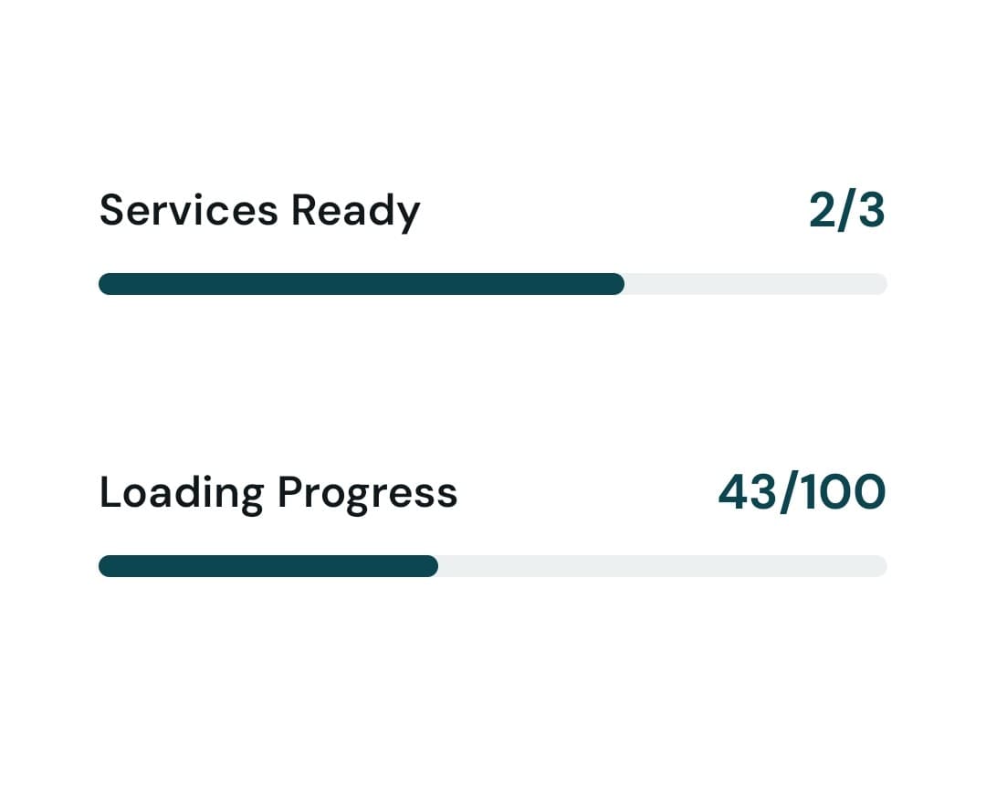
The ProgressCard component displays progress tracking with a visual progress bar. Shows current progress versus total with customizable colors.
Basic Usage
<ProgressCard
  title="Daily Goal"
  current={7}
  total={10}
/>
With Custom Colors
<ProgressCard
  title="Workout Streak"
  current={15}
  total={30}
  progressColor="#4CAF50"
  backgroundColor="#FFFFFF"
  barBackgroundColor="#E0E0E0"
/>
Import
import ProgressCard from "../components/ProgressCard";Props
title(string, Required): Title displayed above the progress bar.current(number, Required): Current progress value.total(number, Required): Total/goal value.progressColor(string, default:Colors.primary): Color of the progress fill.backgroundColor(string, default:Colors.white): Background color of the card.barBackgroundColor(string, default:Colors.gray): Background color of the progress bar track.style(object): Additional style object for the container.