Discovery Bar
The Discovery Bar is an animated search and filter component that morphs between search mode and filter mode. It features smooth spring animations and customizable filter options with icons.
Basic Usage
import { IconTrendingUp, IconStar } from "@tabler/icons-react-native";

<DiscoveryBar
  onSearchChange={(text) => console.log("Search:", text)}
  onFilterChange={(filter) => console.log("Filter:", filter)}
  initialFilter="trending"
  option1={{ id: "trending", label: "Trending", icon: IconTrendingUp }}
  option2={{ id: "featured", label: "Featured", icon: IconStar }}
/>
Custom Colors
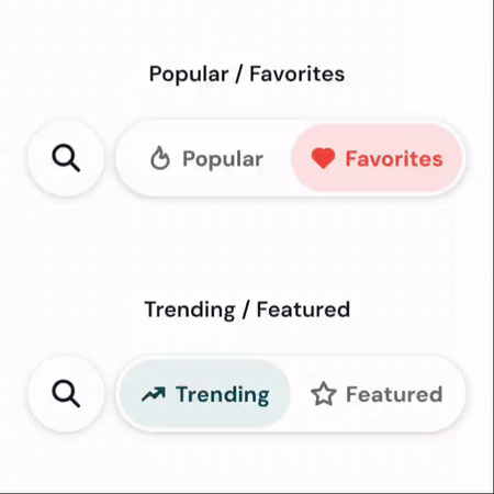
import { IconFlame, IconHeart } from "@tabler/icons-react-native";

<DiscoveryBar
  onSearchChange={(text) => console.log("Search:", text)}
  onFilterChange={(filter) => console.log("Filter:", filter)}
  initialFilter="popular"
  option1={{ id: "popular", label: "Popular", icon: IconFlame }}
  option2={{ id: "favorites", label: "Favorites", icon: IconHeart }}
  activeColor={Colors.error}
  activeBackgroundColor="#fee2e2"
  inactiveColor={Colors.darkGray}
  backgroundColor={Colors.white}
/>
Import
import DiscoveryBar from "../components/DiscoveryBar";Props
onSearchChange(function): Callback fired when search text changes. Receives the search text as a parameter.onFilterChange(function): Callback fired when the active filter changes. Receives the filter ID as a parameter.initialFilter(string, default: “option1”): The ID of the initially selected filter option.option1(object, default:{ id: "option1", label: "Option 1", icon: IconFlame }): Configuration for the first filter option.id(string): Unique identifier for the option.label(string): Display label for the option.icon(React.Component): Icon component from @tabler/icons-react-native.
option2(object, default:{ id: "option2", label: "Option 2", icon: IconHeart }): Configuration for the second filter option.id(string): Unique identifier for the option.label(string): Display label for the option.icon(React.Component): Icon component from @tabler/icons-react-native.
activeColor(string, default:Colors.primary): Color for active tab text and icon.activeBackgroundColor(string, default:Colors.secondaryLight): Background color for the active tab.inactiveColor(string, default:Colors.darkGray): Color for inactive tab text and icon.backgroundColor(string, default:Colors.white): Background color for the entire discovery bar.